
Online Literary Magazine Design: A Practical Guide to Beauty, Readability, and Innovation

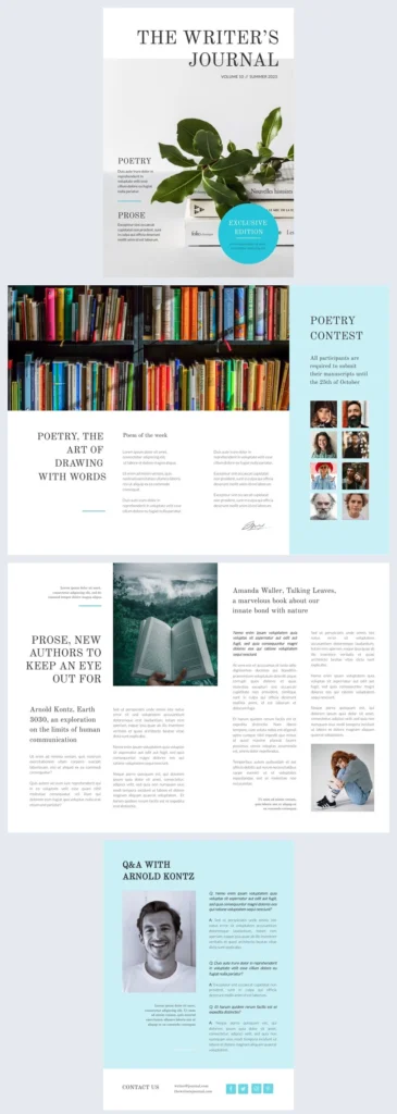
A good online literary magazine design balances careful typography with accessible navigation so readers can move between current issues and archives on a phone. It uses a clear masthead, readable type, and predictable structure rather than visual gimmicks. Editors prioritize legibility and editorial voice; innovation works only when it does not interrupt reading or submissions.
- What makes an online literary magazine design good?
- Typography and mobile-first layout
- Structure, archive, and navigation
- Accessibility as a design requirement
- Innovation and readability: notes from the field
- A short history: print constraints, online affordances
- How design affects your submission
- FAQ
- Sources
What makes an online literary magazine design good?
Literary magazines publish short fiction, poetry, essays, and visual work, often on small budgets. The term "little magazine" describes independent journals that focus on editorial vision over commercial reach. Good online design does not imitate a printed page. It treats the screen as a reading environment: type should be calm, navigation should be obvious, and the archive should stay usable. According to CLMP, independent literary publishers rely on that clarity to keep submissions and issues organized. A strong design also signals editorial seriousness to writers who are deciding where to send work. The masthead, issue structure, and instructions for contributors all become part of the same system. You can read more about this site and its editorial approach on the About page. That is why the term "design" here includes typography, page order, and accessibility rather than decoration alone.
Typography and mobile-first layout
Most readers open a literary magazine on a phone, often between other tasks. Online literary magazine typography therefore starts with body text that is large enough to read without zooming and line lengths that do not require constant horizontal scrolling. Responsive design is the technical foundation: each page must adapt cleanly to narrow screens. The WCAG 2.2 standard sets baselines for text spacing, contrast, and resizing. For magazine editors, a mobile-first layout means testing every page at a narrow width. Headlines should wrap predictably, poetry must keep its line breaks, and prose should never appear in cramped columns. A short checklist for mobile reading:
- Set body text at a comfortable default size, usually 16 pixels or larger.
- Keep line length between roughly 45 and 75 characters on desktop.
- Allow pinch zoom; do not disable it.
- Use enough contrast between text and background.
- Test navigation with only a keyboard, not a mouse.
These settings are not stylistic preferences. They are the minimum conditions for a comfortable reading session on a small screen. When a poem loses its indent or a story scrolls sideways, typography has already failed the reader. Typography also carries brand voice: a serif headline may suit a traditional journal, while a simpler sans-serif can signal a more contemporary one. Editors should also consider how the text behaves when a reader switches to landscape mode or uses a foldable phone; the layout should adapt without breaking line breaks or navigation.
Literary magazine website design works best when each screen has a clear job. A reader should understand the journal's current issue within seconds and find older work without guessing. Prairie Schooner, published by the University of Nebraska–Lincoln, links its archive and issues directly from the main page, which makes the standard pattern easy to see. The table below summarizes the main functions.
| Screen | Primary function | What to check |
|---|---|---|
| Home | Present the current issue and editorial identity | Is the latest issue visible without scrolling? |
| Issue page | Group new work by genre or author | Are poems, stories, and essays separated clearly? |
| Archive | Let readers browse past issues | Is the archive searchable or listed by date? |
| Masthead | Name editors and staff | Are editors' roles and affiliations clear? |
| Submissions page | Explain deadlines and guidelines | Are the submissions window and simultaneous submission policy stated? |
When these functions are mixed together, readers lose the thread. A home page that also tries to serve as a submission portal, archive, and blog becomes noisy. Clear labels and consistent placement matter more than creative menus. Editors should test the archive with a simple question: can someone who has never visited the journal find a story from two years ago in under a minute? If not, the structure is still unfinished. The same rule applies to issue pages: a reader should never wonder whether they are looking at the current issue or an older one.
Accessibility as a design requirement
Accessible literary magazine design treats access as part of the editorial contract, not a technical afterthought. WCAG 2.2 asks publishers to support keyboard navigation, visible focus indicators, and text that can resize without losing content. A reader who uses a screen reader should hear the same structure a sighted reader sees. A practical checklist:
- Ensure all navigation links are reachable by keyboard and show a visible focus state.
- Provide descriptive link text; avoid bare "click here."
- Keep headings in a logical order and use them consistently.
- Make form fields on submission pages clearly labeled.
- Allow text to be resized up to 200 percent without content overlap.
- Test color combinations for contrast, especially on menus and footers.
Accessibility is not only for disabled readers. Clear focus states and larger type help everyone on a small screen. When an issue loads in a reading app or an embedded PDF, the same rules apply; the design should not break. Submission forms with unlabeled fields create a practical barrier, and so do menus that disappear when a keyboard user tabs through them. A magazine that ignores these patterns quietly excludes the very readers it wants to reach.
Innovation and readability: notes from the field
Innovation in online publishing does not have to mean elaborate motion or experimental navigation. The more useful question is whether a design choice helps a reader finish a story, save a poem, or find the archive. Editors often weigh innovation against consistency. A new typeface may express an editorial voice, but it fails if body text becomes hard to read on a phone. A redesigned archive may feel fresh, but it fails if back issues break. The pattern across successful online magazines is quiet innovation: small changes to typography, spacing, and page order that improve the reading experience without announcing themselves. Accessibility and archive usability are forms of innovation, because they ask the publisher to think about every reader, not only the imagined desktop visitor. This approach, with its focus on typography, mobile reading, archival access, and accessibility, is also how this site evaluates literary magazines. The test is practical: close the magazine, reopen it on a smaller screen, and see whether the reading experience still holds together.
A short history: print constraints, online affordances
The early design language of literary magazines came from print. A fixed page, a print run, and a physical table of contents forced editors to plan each issue as a closed object. Online publishing removed those constraints: an issue no longer has to disappear when a print run sells out, and archives can stay available. The Community of Literary Magazines and Presses has long tracked how independent publishers adapt to distribution and funding, while the National Endowment for the Arts supports literary publishing as part of its mission. Free-to-read issues widened the audience for small journals, though many still depend on grants, subscriptions, or a host institution. That shift from fixed pages to flexible screens is the real reason design now matters more, not less. The magazine is no longer just an object; it is a system that has to work for readers who arrive from search, social media, and library databases.
How design affects your submission
Before you submit to an online magazine, read the masthead and archive the same way an editor reads a manuscript. The masthead shows who filters the slush pile, and the archive reveals whether the magazine publishes work like yours. Look for a clear submissions window and a stated policy on simultaneous submissions. Poets & Writers maintains a database of literary magazines with searchable criteria, which is useful when you want to compare guidelines. A site that is difficult to read on mobile, hides its archive, or buries its masthead may be harder for readers to use too. Design is not a substitute for editorial judgment, but it tells you whether a journal has thought through how readers and writers actually use the site.
FAQ
What is online literary magazine design?
Online literary magazine design is the set of typographic, navigation, and archive decisions that make a digital literary journal legible and accessible.
How is it different from print design?
Online design has to work at multiple screen sizes, support keyboard navigation, and keep a navigable archive, rather than fitting a fixed page.
Why does accessibility matter for literary magazines?
A magazine that cannot be read on mobile or with a screen reader loses readers and writers. WCAG 2.2 sets clear minimum standards for accessibility.
What should I look at before submitting to an online magazine?
Look at the masthead, archive, mobile readability, and clear submission instructions.
Sources
W3C Web Accessibility Initiative, WCAG 2.2 Community of Literary Magazines and Presses (CLMP) Poets & Writers, Literary Magazines database Prairie Schooner, University of Nebraska–Lincoln National Endowment for the Arts
Keep reading